Top Types of Statistical Charts and How to Use Them Effectively


- Academic and Language Services
- Fundamental Concepts in Research
- Literature Review
- Master’s and Doctoral Thesis Preparation
- Previous Studies
- Referencing and Citation
- Research Methodologies
- Research Proposal
- Scientific Research Tools
- Services in Saudi Arabia
- Statistical Analysis and Discussion
- Study Abroad Programs
- Success Stories
- Theoretical Frameworks
- Translation
- Universities Guidelines
- Universities News

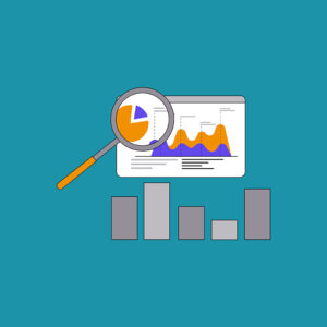
Statistical charts play an important role in simplifying and visually analyzing data, making it easier for individuals and companies to make informed decisions. Whether you’re a student, researcher, or data analyst, knowing the different types of charts helps you present your information more clearly and effectively. In this article, we’ll review the types of statistical charts, their uses, and when each type is the best choice for representing data.
What Are Statistical Charts?
Statistical charts are visual representations of data used to illustrate trends and relationships between different variables. These charts help quickly analyze and present large amounts of data in a comprehensible and easy-to-read format.
The Importance of Using Charts in Data Analysis
Statistical charts play a key role in data analysis, helping to present complex information in an easy-to-understand visual format. Here are some of the main benefits of using charts in data analysis:
- Facilitating Understanding: Simplifies complex information and transforms it into visual forms.
- Identifying Trends: Allows for the discovery of hidden patterns and trends within the data.
- Data Comparison: Makes it easier to compare different data sets to make well-considered decisions.
- Presentation Accuracy: Prevents errors in data interpretation through visual clarification.
Types of Statistical Charts
Statistical charts are used to visually represent data, making it easier to analyze and extract valuable information from it. The types of statistical charts vary depending on the nature of the data and the purpose of the analysis. Here are the most important types of statistical charts and their uses:
Bar Chart
A bar chart is used to represent categorical data through vertical bars. This type is characterized by clarity and ease of comparison between different categories.
When Is It Used?
- When comparing different categories within a given dataset.
- In business data analysis, such as comparing sales of different products.
Practical Example
If we want to compare sales of four types of cars during a specific year, a bar chart can be used to clearly show the differences in sales.
Line Chart
A line chart is used to represent time-series data and show trends over time. Points on the chart are connected by lines that show sequential changes.
When Is It Used?
- Analyzing temporal trends, such as tracking profit growth over the years.
- Comparing financial market performance or stock prices over time.
Practical Example
It can be used to display changes in daily temperatures over a specific month to identify climate trends.
Pie Chart
The pie chart is used to represent parts as a proportion of the whole, making it suitable for analyzing relative distributions of data.
When Is It Used?
- When needing to display the proportion of each item to the total dataset.
- Analyzing budget allocation ratios or demographic composition.
Practical Example
It can be used to display the percentage of types of electronic devices used in a specific company, such as the ratio of desktop computer users compared to laptops and tablets.
Horizontal Bar Chart
It resembles the vertical bar chart but is displayed horizontally, making it more suitable when category labels are long or when there are many categories.
When Is It Used?
- When comparing many different categories with long names.
- Displaying data in surveys or opinion polls.
Practical Example
It can be used to compare literacy rates in different countries, where country names are long and require horizontal display for easy reading.
Histogram
The histogram is used to analyze the distribution of continuous numerical data, where data is divided into equal intervals and represented by adjacent bars.
When Is It Used?
- Analyzing the distribution of values in a dataset, such as the distribution of customer ages or the distribution of scores in a specific test.
- Understanding the spread of data and identifying unusual patterns.
Practical Example
If we want to analyze the distribution of students’ scores in a math test, we can use a histogram to determine how concentrated the students are within certain score ranges.
Scatter Plot
A scatter plot is used to display the relationship between two variables and determine the correlation between them.
When Is It Used?
- When analyzing the relationship between two quantitative variables, such as the relationship between study hours and the grades students receive.
- In scientific and experimental data analysis to identify correlations and trends.
Practical Example
It can be used to analyze the relationship between fuel consumption and car speed, helping to understand how speed affects fuel efficiency.
Box Plot
A box plot is used to display data distribution and highlight outliers within a dataset.
When Is It Used?
- When analyzing distributions and identifying unusual values.
- In medical statistics, such as analyzing the distribution of blood pressure in a specific group of patients.
Practical Example
It can be used to display the distribution of employee salaries within a company, showing the range between minimum and maximum values, the median, and extreme values.
Stacked Bar Chart
It is used to display different components within multiple categories in the same chart, where each bar is divided into stacked parts.
When Is It Used?
- When we want to compare the different parts that make up the total within each category.
- Displaying financial data such as revenue distribution by different departments.
Practical Example
If we want to analyze total sales by different categories in stores, a stacked bar chart can be used to show sales of each category within each store in an overlapping manner.
100% Stacked Bar Chart
It resembles a stacked bar chart, but it displays each bar as a percentage of the total, making it easier to compare different categories.
When Is It Used?
- When comparing relative composition across several groups.
- Display resource utilization ratios in different departments within a company.
Practical Application
It can be used to analyze different income sources within a charitable organization as a ratio of total donations.
Best Methods for Analyzing Statistical Charts
Statistical charts playafundamental role in data analysis and decision-making based on the information presented. However, reading and analyzing these charts correctly requires the use of specific techniques and strategies. Here are some of the best ways to effectively analyze statistical charts:
- Choose the appropriate chartbased on the nature of the data.
- Check for outliersthat may affect the analysis.
- Use colors and formattingwisely to clarify information.
- Compare trends and patternsto draw accurate conclusions.
- Use statistical analysis softwaresuch asExcel, Tableau, and Pythonto analyze data accurately.
Conclusion
The effectiveness of statistical charts depends on selecting the appropriate type for the data to be analyzed and displayed. Proper understanding of these types is essential for accurate data analysis and informed decision-making. Whether you need to compare values, display distributions, or analyze relationships between variables, using the appropriate chart can help simplify data and make it clearer and more impactful.

Comments


موقع "دراسة الأفكار للبحث والتطوير" هو منصة متخصصة في تقديم الخدمات الأكاديمية والبحثية، تستهدف بشكل رئيسي طلاب الدراسات العليا.